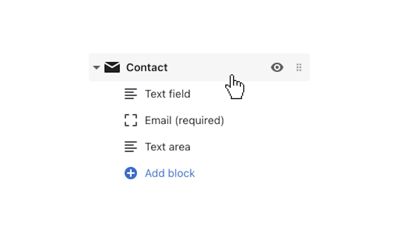
Flex includes a Contact Form section to enhance pages. The form used here is the standard Shopify contact form and submissions are sent to your store’s public contact email address.
Use the contact form settings to control section settings, then add content by adding blocks and configuring block settings.
Contact Form Section Settings
Click the section to open its settings.

Image
Upload an image by clicking Select Image. 1000 x 1000px is the recommended image size. The image will display above your Heading and Text.
Messaging
Within the contact form section, you can choose to add a Heading, Subheading, and Text. This is a great way to add some important info that you want your customers to read before they contact you.
Text alignment
Here you can choose the alignment of text areas. Choose from Left, Center, or Right.
Show social media icons
Enable Show social media icons to have social media icons displayed in the contact form section. Customize these URLs in the Social media portion of the Theme settings.
Form position
Here you can choose the position of your text and image. Choose from Left or Right.
Block Settings
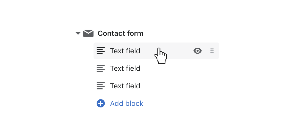
Click one of the preloaded Text field blocks to open its settings.

To add more text fields or another block, select (+) Add block, then Checkbox, Drop-down, Paragraph, Radio buttons, Text area, and Text field.
Email is a required block and included by default.
Option blocks
There are three option-focused blocks: Drop-down, Checkbox, and Radio buttons.

Drop-down and Radio buttons only allow one selection, while Checkbox allows single or multiple selections.
For each of these options, customize the Label using the provided field.
If you're using a drop-down, customize the Placeholder text with the provided field.
Enable the Field is required setting to make the field type mandatory.
Add your options by adding them to the Option 1-6 fields. To use fewer than 6, leave the remaining fields blank.
Text field
The Text field block offers three options: Email, Text area, and Text field.
The Email option allows and requires customers to include their email address with the form submission.
Select Email from Field type, then add your Label and Placeholder using the provided text fields.
Text area
The Text area option provides customers with a larger text field for more detailed messages.
Select Text area from Field type, then add your Label and Placeholder using the provided text fields.
Select Field is required to make this text area mandatory for submission.
Text field
The Text field option provides customers with a text field for more brief information, such as a name, phone number, etc.
Select Text field from Field type, then add your Label and Placeholder using the provided text fields.
Select Field is required to make this text field mandatory for submission.