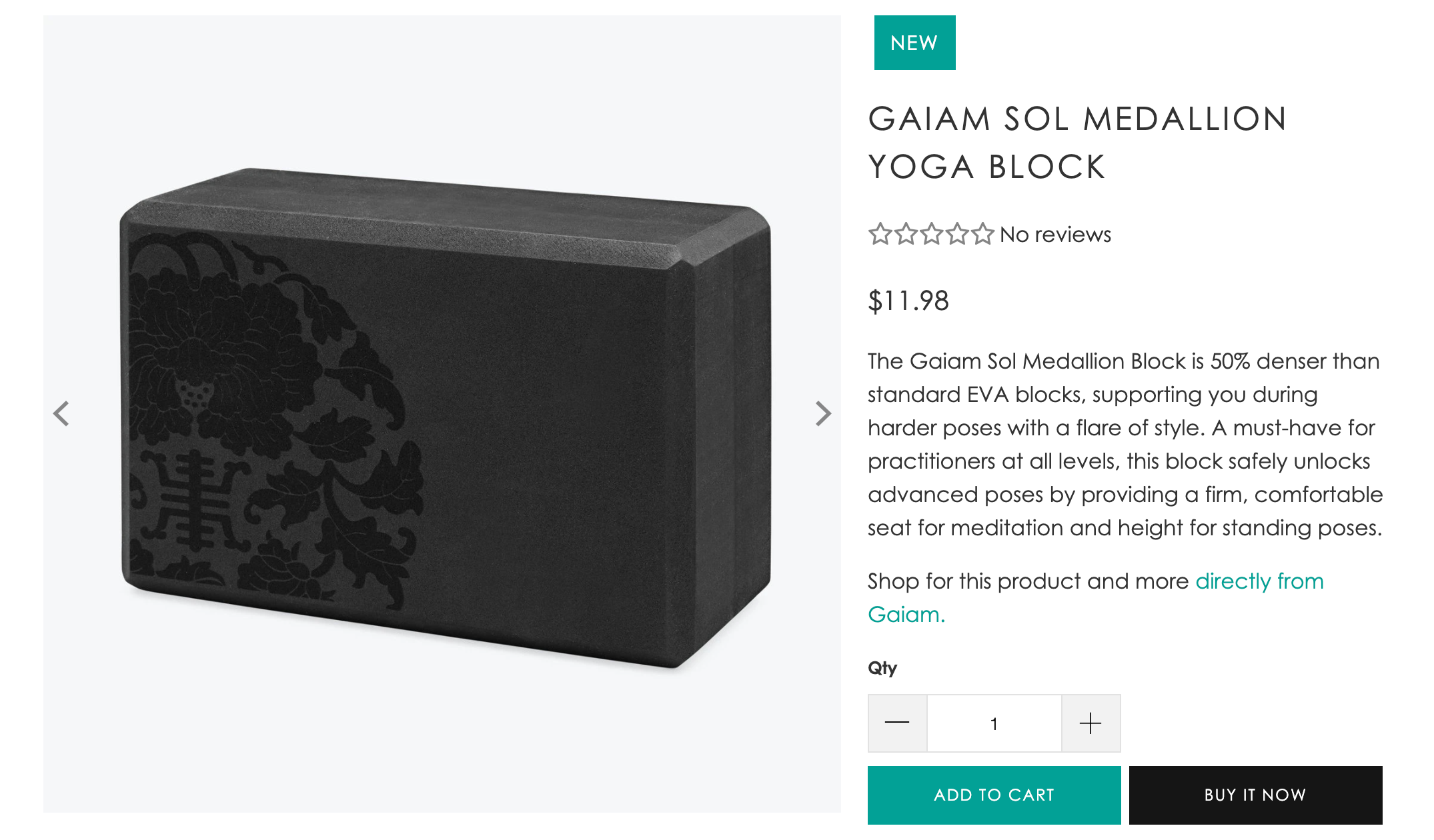
Turbo's Default product template controls the features, layout, and settings for the product page. Merchants use the product page (also known as a PDP or product details page) to highlight the features and benefits of each product. Customers use the features on the product page to learn about the product and add their preferred options to the cart.
Customize template settings
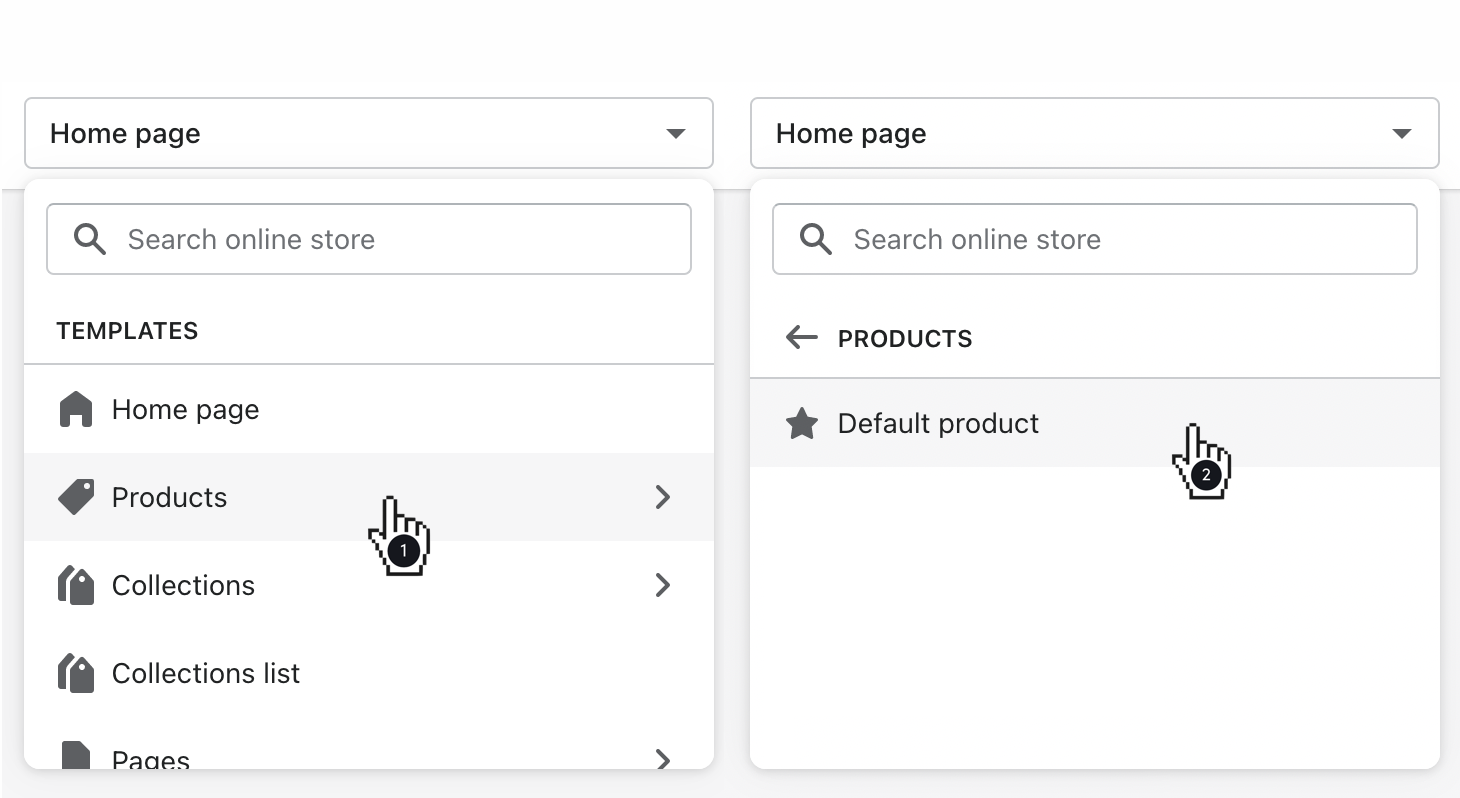
Use the page selector to open Products, then Default product.
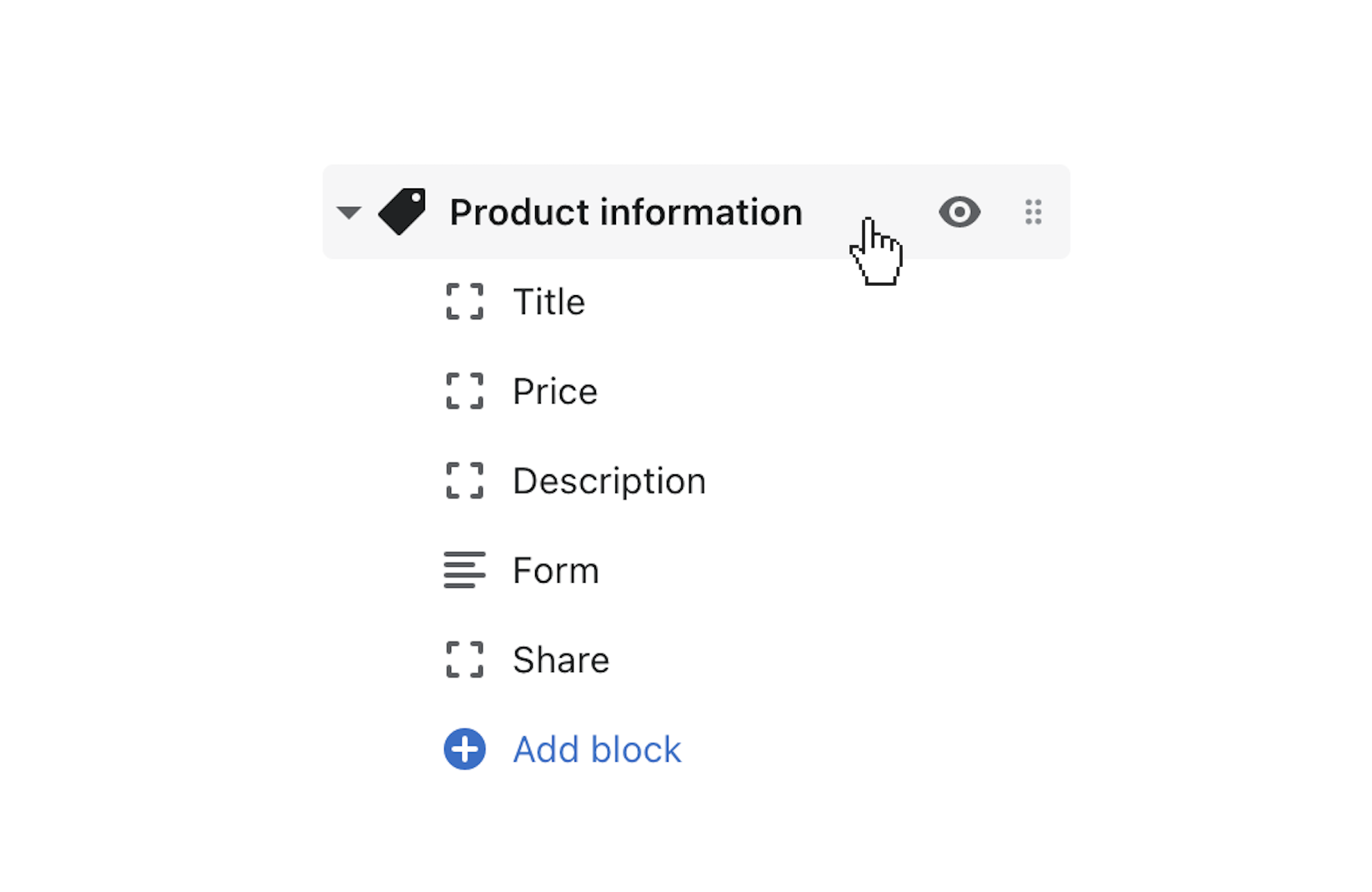
In the left sidebar, click Product information to customize general settings for the template.
Product media position
Select either Left or Right for the Product media position.
Set product media height
To cap the product media with a set height, activate Set height of product media, then use the Product media height slider to control the maximum height.
Show thumbnails
To display all of your product media in the quick shop, select the Show thumbnails setting to display the images as thumbnails.
Show arrows
When enabled, the Show arrows setting displays 'previous' and 'next' arrows for the product media on cursor hover.
Magnify product images on hover
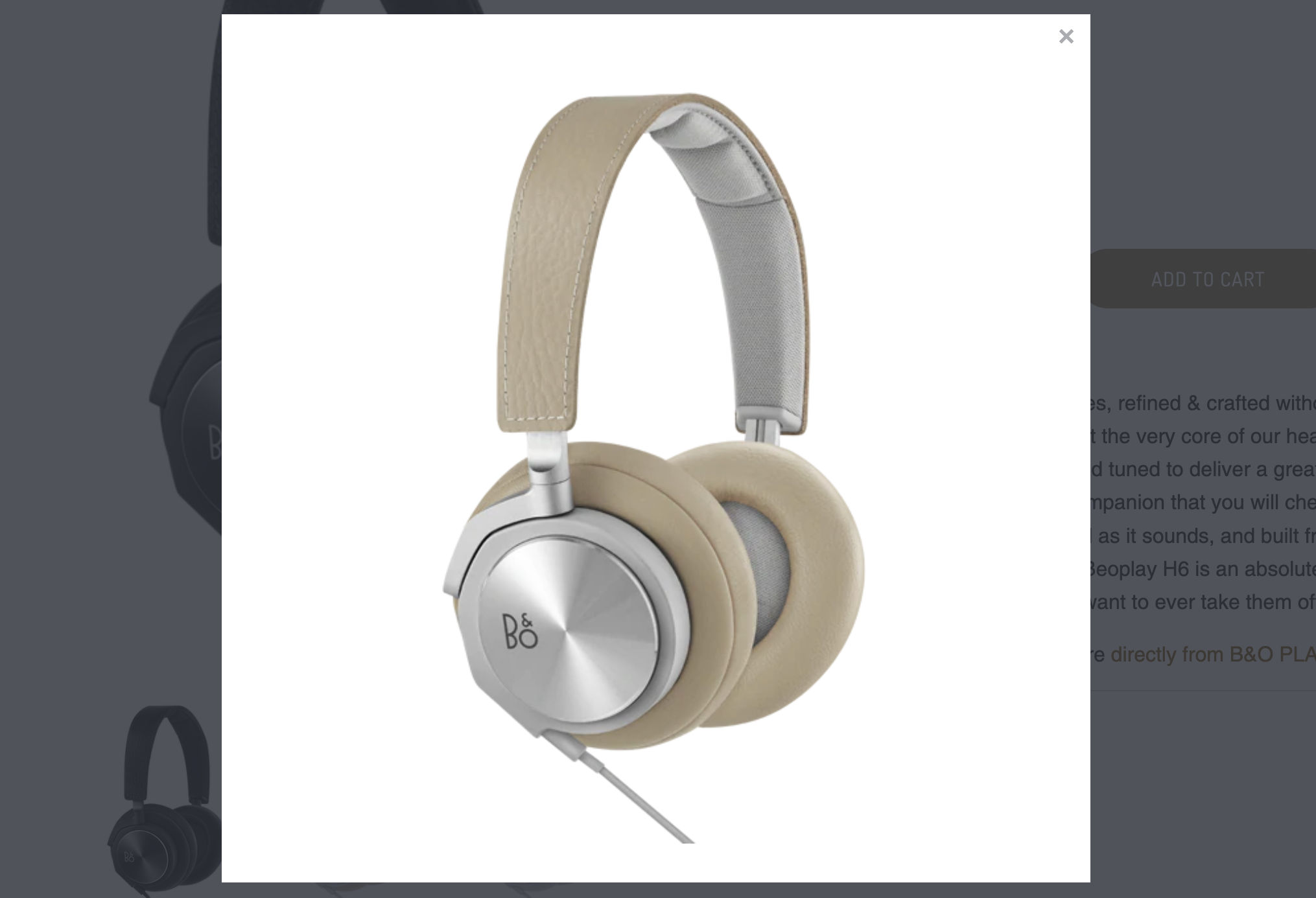
For customers to zoom in to view the product images more closely, enable the Magnify product images on hover.
Transition
Select either Slide or Fade for the Gallery transition setting.
Use the Gallery speed slider to adjust the duration for each slide's visibility.
Thumbnails position
Control the Thumbnails position with the provided dropdown. The options are Left of main image, Right of main image, or Below main image. The left and right positions will display vertically. The bottom positions display horizontally.
Enable thumbnail slider
To gather the thumbnail images in a slideshow-like container, activate Enable thumbnail slider.
Customize the page blocks
Click the toggle beside Product information to reveal the section blocks.
There are blocks for Price, Title, Vendor, Product rating, Description, Share, Collapsible tab, Form, Tabs, Text, Custom Liquid, and Pop-up.
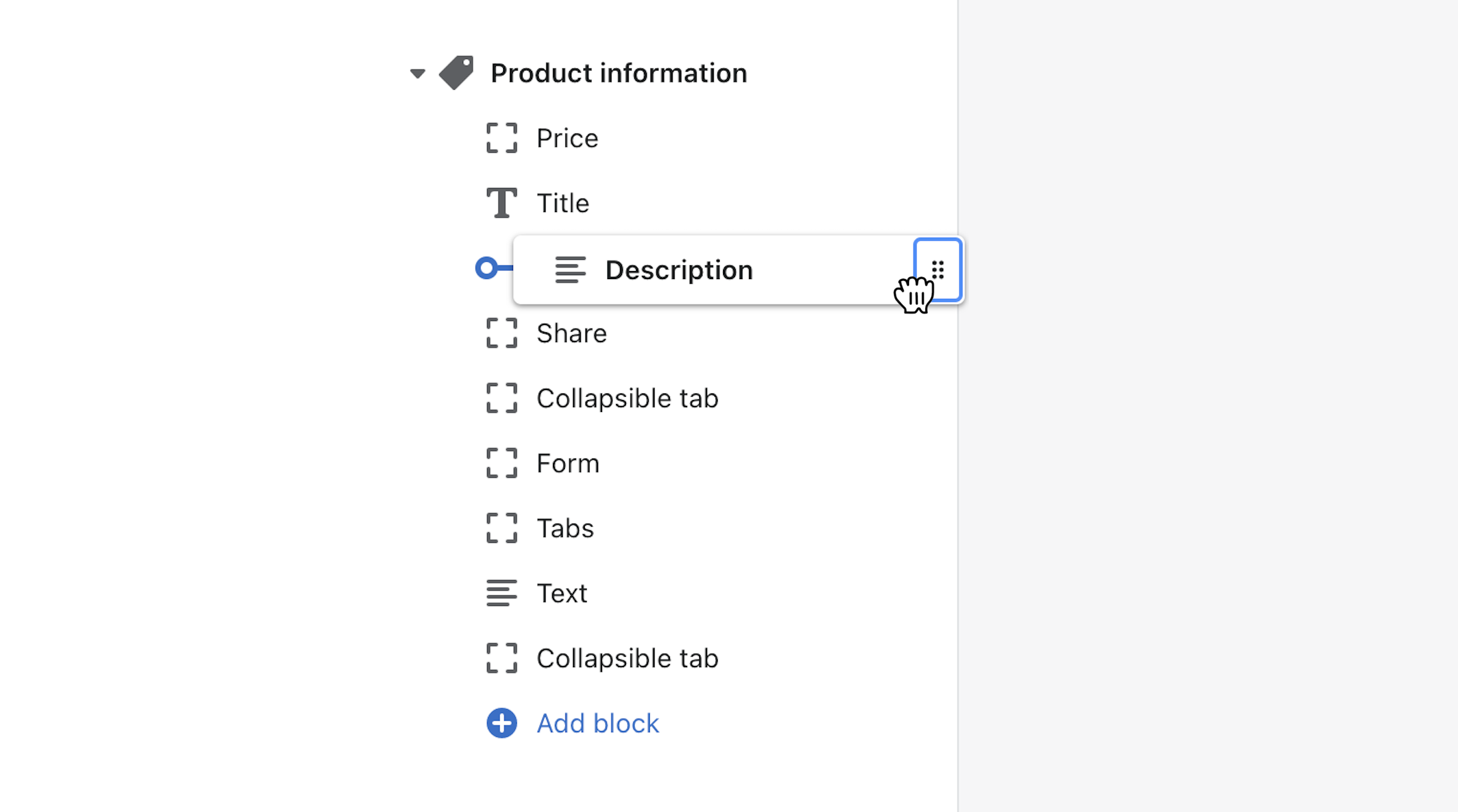
Click, hold, then drag the blocks to reorder their sequence and reposition them on the product page.
Price block
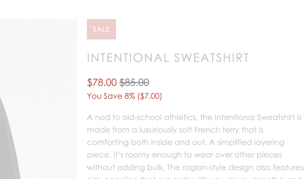
Click to open the Price block, then enable Show price savings to display how much your customer is saving (both percentage and price amount).
Text block
Include text by adding copy to the Text field. Then use the Bold, Italic, and Link controls to style and connect your text with other pages.
Vendor block
Assign Vendors to your products by editing the Organization portion of your Products admin.
SKU (Stock Keeping Unit) block
Add the SKU block to include the stock-keeping unit (SKU) information for the product or variant.
Product links block
Use the Product links block to control the position of the product. Click the block to open its settings.
Display the collection(s) that include this product by enabling Show collections. This displays below the product form.
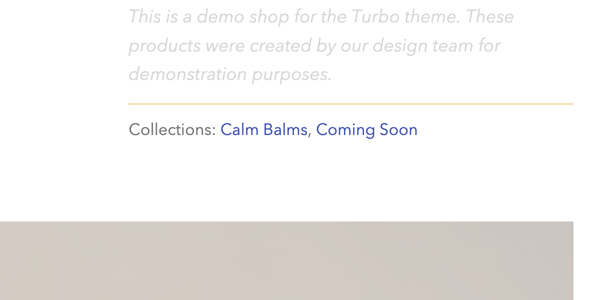
Enable Show tags to display the tags assigned to the product. These appear below the product form as button-like links.
Activate Show type to display the Product type information for the product. Assign this to your products by editing the Organization portion of your Products admin.
Pop-up (Size chart) block
Include a Pop-up for the product page by adding the Size chart block. Click to open the block, then click Select page below Size chart.
Text block
Include more messaging to the product page by adding a Text block.
Add your message to the Text field. Then use the Bold, Italic, and Link controls to style and connect your text with other pages.
Tabs
Add Tabs to showcase information in an interactive layout.
Three tabs by completing the Heading and Text fields.
To include the product's description, enable Show product description.
Position the tabs below the product gallery by enabling Show tabs below product gallery.
The same content will appear for each product using a template. To provide different content for different products, use the classic tabs approach, consider creating additional templates, or use metafields.
Collapsible tab
Add a Collapsible tab block to include product information in an engaging container. Similar to FAQ toggles or accordions, the collapsible tab keeps the Heading visible and reveals the Text when clicked.
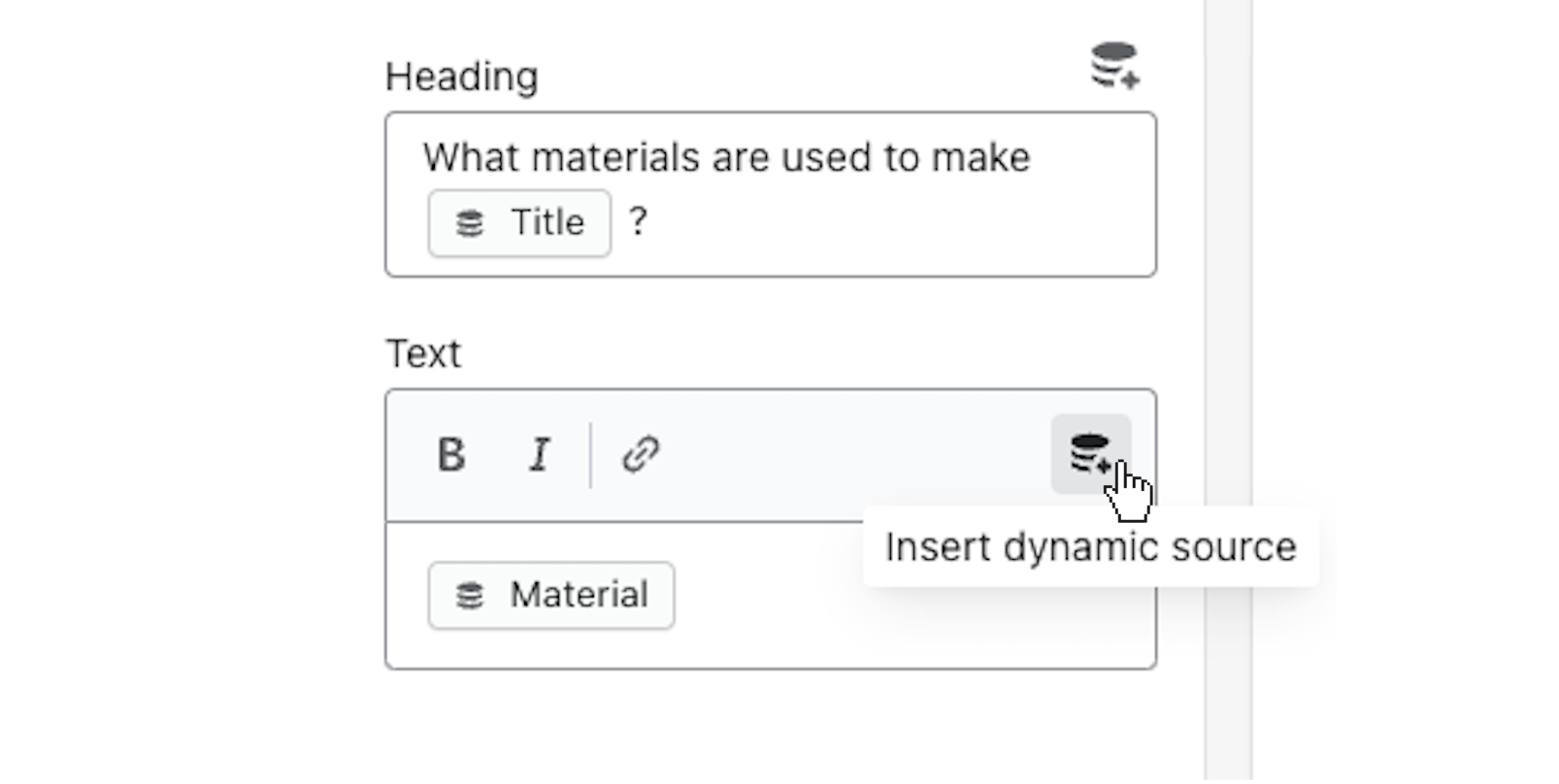
Connect a Single-line text metafield as a dynamic source to have separate content for different products Learn more