Flex includes a customizable Header section. There are 4 layout styles for the feature (Classic, Centered, Search Focus, and Vertical), as well as many built-in settings, including different alignment options, search options, and the ability to add in your own custom CSS.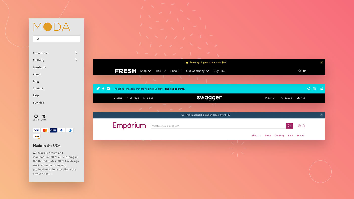
Header Settings & Styles
The section settings allow you to enable features in your Header. There are four different header layout styles to choose from within the theme: Classic, Centered, Search-focused, and Vertical.
Use the Layout portion of the Theme settings to select a Header style option.
Select a Header Style
-
Header Style: Classic
The Classic header style allows for a traditional, default layout with the logo on the left-hand side and the navigation beside.
Logo
Click Select Image to add a logo image for your header. The logo is positioned on the left-hand side when set to the Classic header style. Adjust the logo Width with the provided slider (between 80 - 300px).
Navigation
Click Select menu to connect a Navigation menu.
Select a Menu alignment option (Left, Center, or Right).
To Open dropdowns on click instead of hover, activate the provided setting.
Search
Enable a search feature for the header by enabling Show search.
Icons
By default, there are Icons for the Cart, Search, and Login. To use text instead, select Text only from the Style dropdown. To combine text and icons, select Icons and text.
Overlay
By default, the Classic header will sit above the page content as a distinct section. To have the header overlap and blend with the first section on a page, consider activating the Overlay features.
Click Enable overlay to activate the feature, then use the custom color selectors for the Links, Links hover, and Background.
To increase the contrast between the text and image, enable Show text shadow.
Adjust the Background opacity to control the level of transparency.
Add an Overlay logo to select an image that works well with the overlay layout.
Sticky header
For the header to remain visible when scrolling down the page, activate the Enable sticky on scroll setting. Then adjust the Background opacity and Logo width specifically for the sticky header.
Width
The width can either be set to Standard or Wide. Selecting Wide will spread out the full width of the screen. Selecting Standard will keep the header in a container and not spread the full width.
Vertical alignment
Adjust the vertical alignment to align to the Top, Center, or Bottom
Advanced
The Header includes an option to add in your own CSS class and custom CSS.
More information about using the Advanced CSS feature.In the CSS Class field, you can create a new class to apply to the section, or you can add a class that already exists to apply those styles as well.
The Custom CSS field is where you can add in the actual CSS code.
-
Header Style: Centered
The Centered header style allows you to center both your logo and your main menu. The logo can be in between your main menu, or above the main menu.
Logo
Click Select Image to add a logo image for your header. The logo is positioned in the center of the header when set to the Centered header style. Adjust the logo Width with the provided slider (between 80 - 300px).
Select a Menu position to place the logo between the navigation menu (Between menu) or above the menu (Above menu).
Navigation
Click Select menu to connect a Navigation menu.
Select Default, Minimum, or Maximum for the Menu spacing setting.
To Open dropdowns on click instead of hover, activate the provided setting.
Overlay
By default, the Centered header will sit above the page content as a distinct section. To have the header overlap and blend with the first section on a page, consider activating the Overlay features.
Click Enable overlay to activate the feature, then use the custom color selectors for the Links, Links hover, and Background.
To increase the contrast between the text and image, enable Show text shadow.
Adjust the Background opacity to control the level of transparency.
Add an Overlay logo to select an image that works well with the overlay layout.
Sticky header
For the header to remain visible when scrolling down the page, activate the Enable sticky on scroll setting. Then adjust the Background opacity and Logo width specifically for the sticky header.
Width
The width can either be set to Standard or Wide. Selecting Wide will spread out the full width of the screen. Selecting Standard will keep the header in a container and not spread the full width.
Vertical alignment
Adjust the vertical alignment to align to the Top, Center, or Bottom
Advanced
The Header includes an option to add in your own CSS class and custom CSS.
More information about using the Advanced CSS feature.In the CSS Class field, you can create a new class to apply to the section, or you can add a class that already exists to apply those styles as well.
The Custom CSS field is where you can add in the actual CSS code.
-
Header Style: Search Focus
The Search focus header style displays a prominent search bar and is great for large inventory shops.
To adjust the Placeholder text in the search bar (What are you looking for? by default), you can do so in the language files (Edit languages).Logo
Click Select Image to add a logo image for your header. The logo is positioned on the left side of the header when set to the Search focus header style. Adjust the logo Width with the provided slider (between 80 - 300px).
Search button
You can set the specific colors for both the Background and Icon of the search button.
Icons
By default, there are Icons for the Cart, Search, and Login. To use text instead, select Text only from the Style dropdown. To combine text and icons, select Icons and text.
Navigation
Click Select menu to connect a Navigation menu.
Select a Menu alignment option (Left, Center, or Right).
To Open dropdowns on click instead of hover, activate the provided setting.
Sticky header
For the header to remain visible when scrolling down the page, activate the Enable sticky on scroll setting. Then adjust the Background opacity and Logo width specifically for the sticky header.
Width
The width can either be set to Standard or Wide. Selecting Wide will spread out the full width of the screen. Selecting Standard will keep the header in a container and not spread the full width.
Vertical alignment
Adjust the vertical alignment to align to the Top, Center, or Bottom
Advanced
The Header includes an option to add in your own CSS class and custom CSS.
More information about using the Advanced CSS feature.In the CSS Class field, you can create a new class to apply to the section, or you can add a class that already exists to apply those styles as well.
The Custom CSS field is where you can add in the actual CSS code.
-
Header Style: Vertical
The Vertical header style allows for a vertical that displays on the left-hand side of the screen that remains fixed when scrolling down through the site. This header layout is configured with section settings and blocks in the theme editor (Customize).
General settings
Click the Header section to open its general settings.
Alignment
The content in the vertical header can be either Left aligned or Center aligned. Use the Alignment dropdown to control the header content's alignment.
Navigation setting
To Open dropdowns on click instead of hover, activate the provided setting.
Advanced
The Header includes an option to add in your own CSS class and custom CSS.
More information about using the Advanced CSS feature.In the CSS Class field, you can create a new class to apply to the section, or you can add a class that already exists to apply those styles as well.
The Custom CSS field is where you can add in the actual CSS code.
Customize blocks
There are blocks for the Logo, Icons, Search form, Navigation, Payment icons, Copyright, Currency and languages, Social media, and Text. Some blocks have dedicated settings, so click the block to customize it.
Logo block
Click the Logo block to customize its content.
Click Select Image to add a logo image for your header. Adjust the logo Width with the provided slider (between 80 - 300px).
Icons block
Click the Icons block to customize its content.
By default, there are Icons for the Cart, Search, and Login. To use text instead, select Text only from the Style dropdown. To combine text and icons, select Icons and text.
Navigation block
Select (+) Add block then Navigation to add a menu to your header. Open the block to customize it.
Click Select menu to connect a Navigation menu.
Select colors for the Background, Link, and Hover colors for your menu items.
Search form
The Search form block is added by default but there are no block settings for the feature. To remove the block, open the block and select Remove block.
Social media
Display social media links in your header by adding the Social media block. Configure your links in the Social media portion of the Theme settings.
Text
Add a Heading and Text with the Text block.
Copyright
Click the Copyright text block to customize the Copyright text and control the theme and platform credits.
By default, ©, the year, and your Shop Name will display for the copyright (adjust this in your Language editor). Add some additional information with the Copyright text field.
Disable the theme designer credits by deselecting Show theme designer credits.
Disable the platform credit (Powered by Shopify) by deselecting Show Powered by Shopify.
Payment icons
To include payment icons in the header, add a Payment icons block. The icons that show are determined by what you've set up in your store's payment settings.