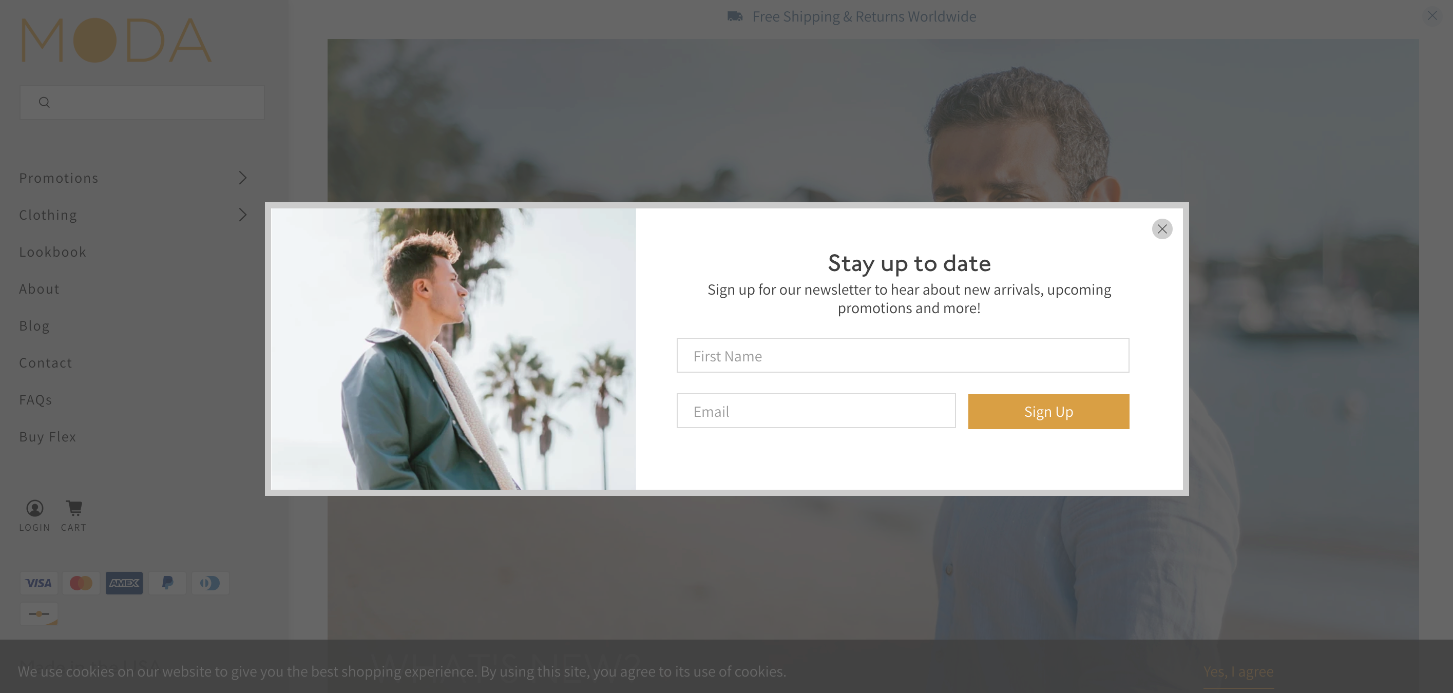
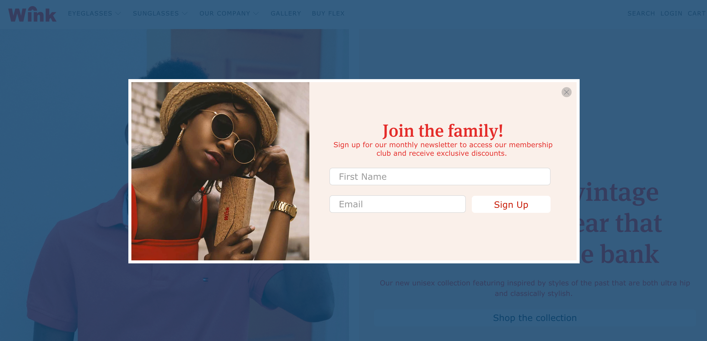
Flex includes a Popup feature to encourage customers to subscribe to your newsletter, learn about new products, participate in campaigns, and access special sales and discounts.
When enabled, your popup will appear on top of your store page content with an optional overlay behind it, if you'd like more contrast between the popup and your shop content.
The Popup includes options to add an image, text, and signup form. For further flexibility, you can select a load in animation for the popup and add custom CSS within the theme editor section settings.
Activate the Popup
In the theme editor (Customize), open the Layout portion of the Theme settings.
Select Show popup to activate the feature.
Return to the main sidebar view to customize the Popup section.
Customize the Popup
Once the popup is enabled, a Popup section will be included at the bottom of the sidebar as its own customizable section. Click Popup to open the section's settings.
Show close icon
The close icon for the popup is optional, so enable or disable the close icon with the Show close icon setting.
Show popup on mobile
Enable the popup for mobile devices by activating Show popup on mobile. Unlike the desktop view, it will be fixed to the bottom of the screen on your mobile phone (instead of a full-screen takeover).
Border
Add a border around the popup by enabling the Show border setting. Then select a Border color with the labeled color picker field and control the Border width with the provided slider.
Heading/Subheading
To add text to your popup, you can fill in the Heading and Subheading fields.
Text alignment
Select Left, Center, or Right for the Text alignment.
Text/Background Colors
Use the Text and Background color selectors to customize the colors.
Show signup form
To have the signup form display in the popup, simply enable the Show signup form setting.
Show first name/Show last name
Include fields for the first and last name by enabling Show first name and Show last name.
Image
Include an Image in the popup by clicking Select Image.
If you've uploaded an image, you can crop it to match the height of your text content with the Image cropping setting. The options are Left, Center, Right, or None (disabled).
Select Left or Right from the Image position setting to control the layout of the image and text.
Overlay/Overlay opacity
The popup includes an Overlay on desktop. The overlay is the semi-transparent background between the popup and page. Select a color for the overlay then adjust the Opacity slider to a value between 0% and 100%.
Popup delay
The popup delay setting lets you decide how quickly your popup will appear after a visitor has arrived at your site! Choose from 0 seconds - 120 seconds.
Days until popup is displayed again
Control the frequency for your popup by selecting 2, 7, 14, 30, 90, or 365 days from the Days until popup is displayed again setting.
Animation
The Animation setting will determine how the section 'loads in'. The options for animation are None, Fade in, Fade in down, Fade in left, Fade in right, Slide in left, Slide in right, and Zoom.
Custom CSS
Add Custom CSS to the popup for further tweaking. You can even create your own CSS class here, as well. Check out this article for more information: Flex Guide: Custom CSS Feature
In the CSS Class field, you can create a new class to apply to the section, or you can add a class that already exists to apply those styles as well.
Theme-Wide Form Settings
Additionally, there are some settings for the signup form that will apply to all forms theme-wide. The ability to Show placeholder text for the fields within all forms and select the Button style for the submit button.
These settings can be found by going into Customize (your Theme Editor) > Theme Settings > Elements > Forms.
Use placeholders
If you want the labels for the form fields to display within the field, you can enable the Use placeholders setting. This will move the text from above the field, to inside it.
Button style
Select Primary, Secondary, or Link for the Button style.
Examples
Example 1 - Wink demo shop
Example 2 - Moda demo shop